INCOME, LIFE& EXPECTANCY
FIVE SHEETS DESIGN
USER GUIDE
Overall
The author is applying a shiny R package with the development in form of a dashboard to optimise the reader experience in term of exploring visualization along with its data. Generally, this dashboard is divided into 2 main sections including Charts and Raw data section. In the Charts section, there are 4 sub items included namely Motion chart, Heat map & Geo map. The title panel of the dashboard is Income, Life Expectancy & Child Mortality: A Global Overview. Besides the title is the Menu icon developed for the purpose of showing and not showing the sections, which is helpful for readers to expand the window for more interactions. Boxes are the main components of each section which may help readers getting more comfortable with the familiar design and friendly control. The motion chart introduced by the reporter here is the main chart of this dashboard, followed by a heat map and finally a geo map. The details below will show readers the flow of the dashboard and how to control as well as explore this visualization effectively.
Motion chart
There are 3 main boxes in the Motion chart section including the first box of controlling (1), the second box showing bubble chart (2) and finally the box showing brushed data table.
In controlling box (1), there are 4 components for execution. Y-axis Variable including 3 measures: Life Expectancy (default), Income and Child Mortality which represents the y axis in this bubble chart meanwhile Bubble Size Variable allows readers to choose among 3 measures above for the deeper details of each measure. In addition, this controlling box also allows readers to choose all Continents or one or as many continents as they want to explore. Finally, the slider input for Year, which is from 1800 to 2019, which let readers can drag in time ranges within 2-year inputs and then click the Animation button to see an interactive bubble chart on the right-hand side.
In the showing bubble chart box (2), depends on which y-axis and bubble size variable, the readers can receive different bubble charts which are total of 9 charts in this box. 5 colours represent for 5 regions of the data: Asia (light blue), Oceania (yellow), Europe (green), Americas (deep blue) and Africa (purple). The default x-axis is Year from 1800 to 2019 as mentioned. The main interactive of this chart is not only the movement of its animation but also the brush function. By brushing the chart, the readers can see details of those data they have brushed. They even can fix the brush shape and then move it around the chart to see differently the data.
In the showing table box (3), this is the result of the brushing function above. This allows readers can see the data of those areas brushed. The table including information on Country, Year, Income, Child Mortality, Life Expectancy and Continent which can be filtered from A to Z or from highest to lowest and versus depending on the purpose of readers. It also has a function for searching as well as options for showing entries (10, 25, 50, or 100) at one time.
Heat map
In the Heat map section, there are two main boxes including the first box of controlling (1) and the second box showing an interactive heat map.
As a Motion chart controlling box, this Heat map controlling box (1) also has two select input functions namely Region and Measure. The Region control still allows readers to choose among those regions. In this heat map function, the reporter decided to remove the All choice due to the size of this choice for the heat map will be too large for the width of the box as well as it is not necessary helpfully to have this function. In total, this section has 15 heat maps for 5 regions and 3 measures.
The box showing the heat map is the main box in this section. At a glance, by looking into the heat map, readers can recognise a series of the year in the x-axis quite complicated. This is a drawback of the heat map which is discussed in the 5 sheet designs above. However, to solve that problem, the heat map has a function that allows readers to zoom in as many as they can to see all details of Country, No and Value. On the left-hand side of the heat map, the reporter developed a clustering option which is displayed in 3 colours. Having this function get readers can recognise which country is clustered to each other uncomplicatedly. On the right-hand side, there are a variety of country names represented the row of the development through the years.
As mentioned about the function of zooming, it allows readers can see any area of each heat map from the country to the year. The below picture shows the advancement of this function, which solved completely the drawback of many years overlapped. To return to the original view, the readers just need to double click into that heat map.
Geo map
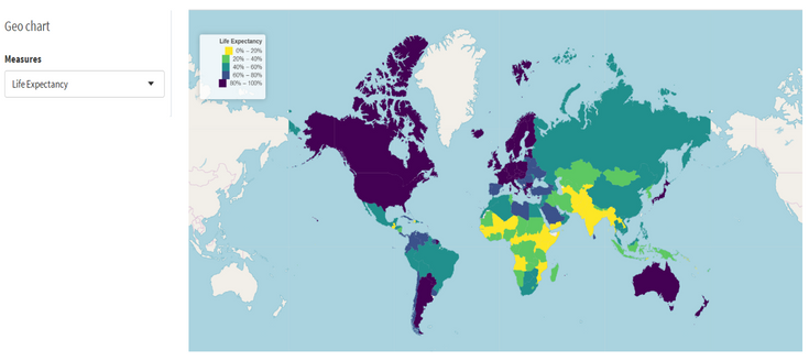
In this Geo map section, there are two main boxes developed which are select input control and box of rendering leaflet.
As two above charts, the select input function includes 3 choices: Income, Life expectancy and Child Mortality. Meanwhile, in the box of the rendering leaflet, we can see different colours correspond with each measure. The colour here the author developed 5 sets for 5 ranges of value, 0-20%, 20-40%, 40-60%, 60-80% and 80-100%. By looking at the map, the readers can easily figure out which region has which range it belongs to.


